
BRAND STRATEGY & CREATIVE STRATEGY CASE STUDIES
From Disconnected to Deeply Aligned
A brand refined over time, evolving from experiential beginnings to strategic corporate connection.
Part of our Three-Path Model™, this project focused on the Expression Path, meeting Joy where she was to uncover insight before expression.
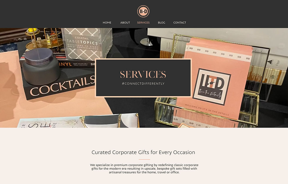
It's in the Details
FOUNDER:
Nita Cintron
TITLE:
Corporate Connector
INDUSTRY:
Corporate Relationship Strategy & Gifting Experience
THREE-PATH STAGE
Brand Clarity, Expression, Stewardship
%20(5_5%20x%207%20in)%20(Instagram%20Post%20(45))%20(4).png)
The Starting Point
When It's in the Details, led by Nita, first entered our world, the brand existed more as an idea than a fully realized identity.
Nita had a clear instinct for creating meaningful, thoughful experiences, ones that made people feel genuinely seen and valued. But the brand itself didn't yet reflect that depth. Previous visual work leaned decorative rather than intentional. It was pleasant but it didn't capture her professionalism, elegance, or the relational intelligence behind her work.
When we reconnected, the goal wasn't a quick visual refresh.
It was something deeper: alignement.
Rather than rushing toward a new look, we began by slowing down, allowing the brand to take shape alongside Nita's own growth as a founder and leader. Over time, clarity replaced uncertainty. Direction replaced decoration.
What started as a travel and events focused business gradually evolved through several chapters, each one sharpening purpose, confidence, and focus, ultimately becoming It's in the Details: a brand built around connection, care, and long-term relationships.

A stylescape developed at the outset of this engagement to establish brand direction, tone, and visual language before design began.
The Work Beneath the Surface
BUILDING CLARITY BEFORE EXPRESSION
Before anything became visible, the work happened beneath the surface.
Together, we explored what It's in the Details truly stood for, not just what it offered, but the role it played in the lives and businesses it served. We clarified her voice: refined yet warm. Professional, yet deeply personal. We reframed the brand from "gift curator" to corporate connector, someone who designs relationships, not just packages.
As clarity deepened, decisions across the business, creative, strategic, and operational, began to align. The brand stopped feeling like something she had to perform and started feeling like something she could stand inside of.
This was not a single phase of work, but an ongoing evolution, one where the brand matured alongside the founder leading it.


A selection of brand deliverables from this engagement
Stylescape developed during strategy sessions to visualize the brand's tone and strategic direction
Giving Clarity Presence
TRANSLATING INTENTION INTO PRESENCE
Once the foundation was solid, expression followed naturally.
We developed an identity system that captured both refinement and approachability, a brand that could confidently operate in corporate spaces while maintaining its human warmth.
This included:
A refreshed logo suite and evolved color system that introduced stronger contrast and hierarchy, supporting a more corporate-ready presence
An updated brand illustration reimagined to reflect connection, craftsmanship, and a place, honoring both San Diego and expanding scope
A cohesive suite of tactile brand materials, packaging, ribbons, tags, stationery, and catalogs designed to feel intnetional at every touchpoint
Naming systems and curated collections that transformed gifting into experience
Foundations for brand activations and corporate collaborations, positioning gifting as storytelling rather than transactions.
Behind the scenes, we also support the systems that hold the brand together, ensuring that operations, workflows, and client experience reflected the same care and consistency as the visuals themselves.
STEWARDSHIP IN PRACTICE
A partnership that evolves
Our work with It's in the Details has never been static.
Through ongoing collaboration, we continue to guide:
Creative direction across new offerings and seasonal collections
Strategic thinking around partnerships and corporate activations
Visual storytelling that maintains continuity as the brand grows
Refinement of systems to support scale without losing intention
Together, we've built a rhythm, one where strategy and design move together, guided by trust and long-term thinking.
Today, It's in the Details is more than a gifting brand.
It's a platform for meaningful connection, bridging creativity and business culture through thoughtful, intentional experiences.
The Broader Pattern
What Nita navigated is a challenge that scales with ambition.
As It's in the Details grew, expanding into new markets, attracting corporate clients, building partnerships with established brands, the brand was asked to carry more weight than its original expression was built to hold. The visual identity, the messaging, the operational experience all needed to speak to a more sophisticated audience without losing the warmth and intentionality that defined the brand from the beginning.
This is the tension many growing organizations face. The brand that launched the business is rarely the brand that can sustain its next stage of growth. Messaging that once felt personal begins to feel inconsistent. A visual identity built for early clients stops resonating with the ones the organization is now trying to attract.
Brand maturity isn't about redesigning everything. It's about understanding what the brand has become, and building the systems that allow it to keep pace with where the organization is going.
Where Clarity Led
A BRAND BUILT TO LAST
What makes this journey possible isn't a single deliverable, it's stewardship.
Nita moved from questioning how her brand should look to leading one that reflects her confidence, clarity, and presence. The brand no longer lags behind her growth, it evolves with it.
It's in the Details now stands as a fully aligned expression of its founder and its mission: a business built not just to be beautiful, but to endure.
Giving Clarity Form
TRANSLATING INTENTION INTO PRESENCE
Once the foundation was solid, expression followed naturally.
We developed an identity system that captured both refinement and approachability, a brand that could confidently operate in corporate spaces while maintaining its human warmth.
This included:
A refreshed logo suite and evolved color system that introduced stronger contrast and hierarchy, supporting a more corporate-ready presence
An updated brand illustration reimagined to reflect connection, craftsmanship, and a place, honoring both San Diego and expanding scope
A cohesive suite of tactile brand materials, packaging, ribbons, tags, stationery, and catalogs designed to feel intnetional at every touchpoint
Naming systems and curated collections that transformed gifting into experience
Foundations for brand activations and corporate collaborations, positioning gifting as storytelling rather than transactions.
Behind the scenes, we also support the systems that hold the brand together, ensuring that operations, workflows, and client experience reflected the same care and consistency as the visuals themselves.
STEWARDSHIP IN PRACTICE
A partnership that evolves
Our work with It's in the Details has never been static.
Through ongoing collaboration, we continue to guide:
Creative direction across new offerings and seasonal collections
Strategic thinking around partnerships and corporate activations
Visual storytelling that maintains continuity as the brand grows
Refinement of systems to support scale without losing intention
Together, we've built a rhythm, one where strategy and design move together, guided by trust and long-term thinking.
Today, It's in the Details is more than a gifting brand.
It's a platform for meaningful connection, bridging creativity and business culture through thoughtful, intentional experiences.
What This Made Possible
A BRAND BUILT TO LAST
What makes this journey possible isn't a single deliverable, it's stewardship.
Nita moved from questioning how her brand should look to leading one that reflects her confidence, clarity, and presence. The brand no longer lags behind her growth, it evolves with it.
It's in the Details now stands as a fully aligned expression of its founder and its mission: a business built not just to be beautiful, but to endure.